

 +49 (0)30 44 32 41 66
 hello@sapera-studios.de
 LinkedIn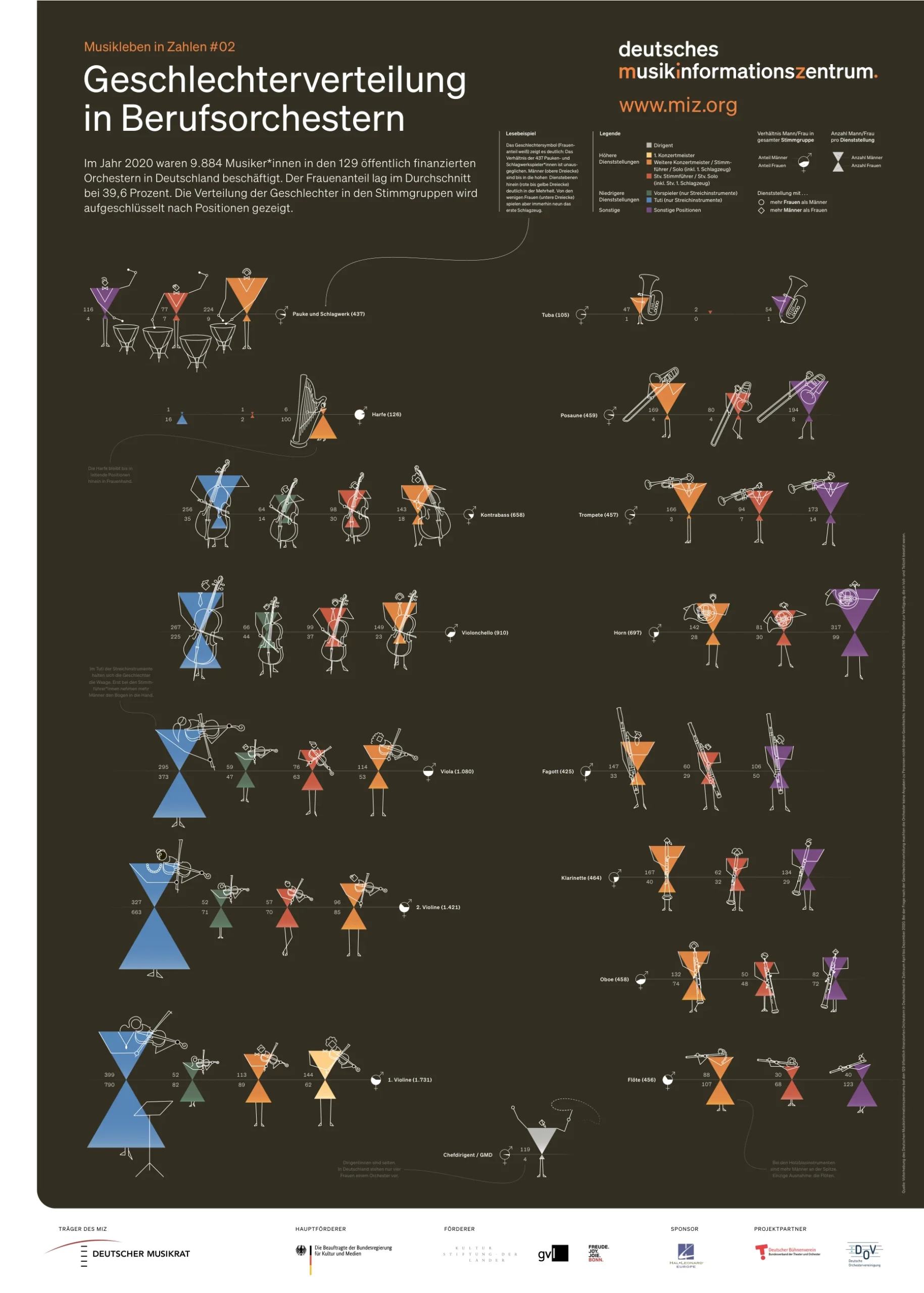


Managing Director
A graphic isn't meant to impress — it's meant to answer a question. Whether it holds up isn't decided by its design, but by whether it survives the first follow-up question: Where does the number come from, what does it relate to, how reliable is it?
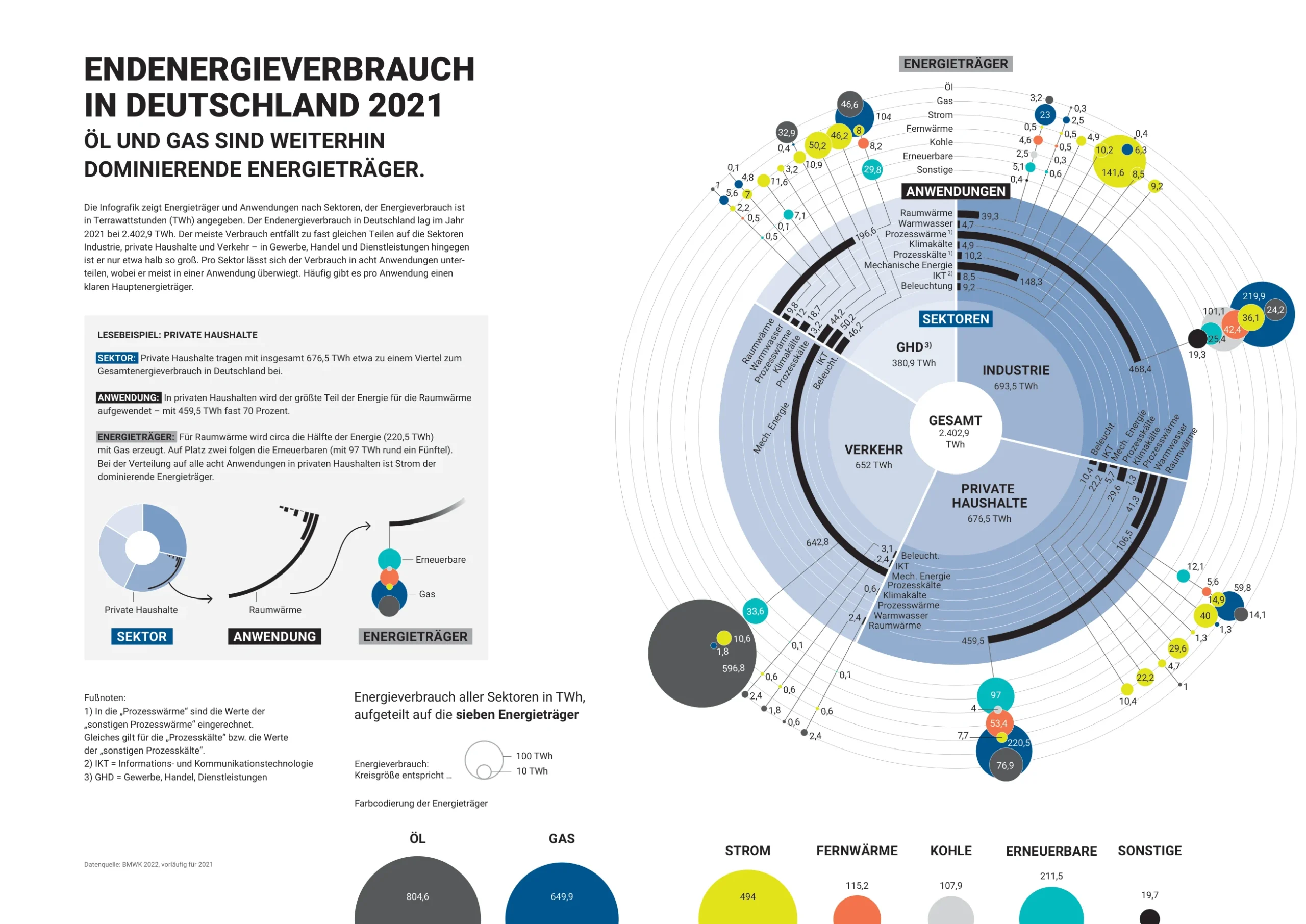
We work where figures are publicly scrutinized — climate targets, energy balances, building data, study results. Whoever publishes them becomes measurable. That applies to corporate communication just as much as to science communication.
Every graphic is built from scratch, because nothing is reusable.
The same number looks different in the report than in the presentation and the social post.
Base year and reference value are buried in a footnote — or missing entirely.
Anyone in-house who needs a graphic has to wait for the agency.
Charts and explainer graphics that keep the base year, reference value, and range visible — instead of smoothing them away.
Building blocks, a color logic, and templates that the next graphic grows from — without starting from zero.
Studies and datasets as a guided narrative that carries both expert and general audiences at once.
Sustainability reports, building reports, annual reports — from data review through to final artwork.
Calculators, maps, browser games. For numbers you have to try out to understand.
So what gets built in-house keeps fitting the brand — even when generative tools help make it.
Three projects at three different scales — for a music information center, a medical technology company, and a retail group.
Six clients, six data situations: corporate climate targets, building stock, club finances, biodiversity, zoonotic disease research, and hydrogen on the high seas.
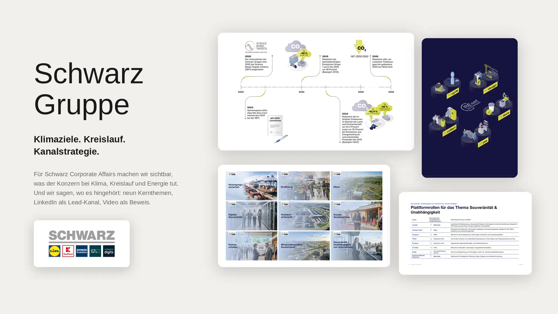 Schwarz GroupInfographic system for climate targets, energy strategy, and circular economyView project →
 German Energy Agency (dena)Infographics for the dena building reportView project →
 LeopoldinaScrollytelling “15 answers to 15 questions on biodiversity”View project →
 German Primate CenterScrollytelling that explains zoonotic disease research for policy and the publicView project →
 Flagship project H₂MareGreen hydrogen on the high seas as a browser gameView project →
 FC St. Pauli 1910The club’s first sustainability report: over 100 pages, more than 20 infographicsView project →
All formats from a single metric to an interactive dashboard, plus examples from projects for the Federal Foreign Office, dena, NABU, and the DFB.
View credentialsA defined infographic series is ready within a few weeks. A visual system with library and handover runs over several months. Data visualization as an ongoing in-house task — with standards, sign-off, and training — is a year-long undertaking.
In the initial conversation, we estimate it based on comparable projects. Describe your project

Sapera Studios GmbH
Kastanienallee 10
10435 Berlin
Sapera Studios ist eine Strategie- und Kommunikationsberatung für komplexe Themen in Berlin. Von der Strategie bis zur Umsetzung.
Storytelling, Narrative und Strategie · Faktencheck · Designsysteme · Beteiligung und Befähigung · Change Management und Prozessbegleitung
Mit Aude befähigen wir Teams, mit KI Kommunikation zu machen, die stimmt und zur Marke passt.

 Datenschutz
 Impressum